Design Spotlight:
Rebranding UpNorth Media Center
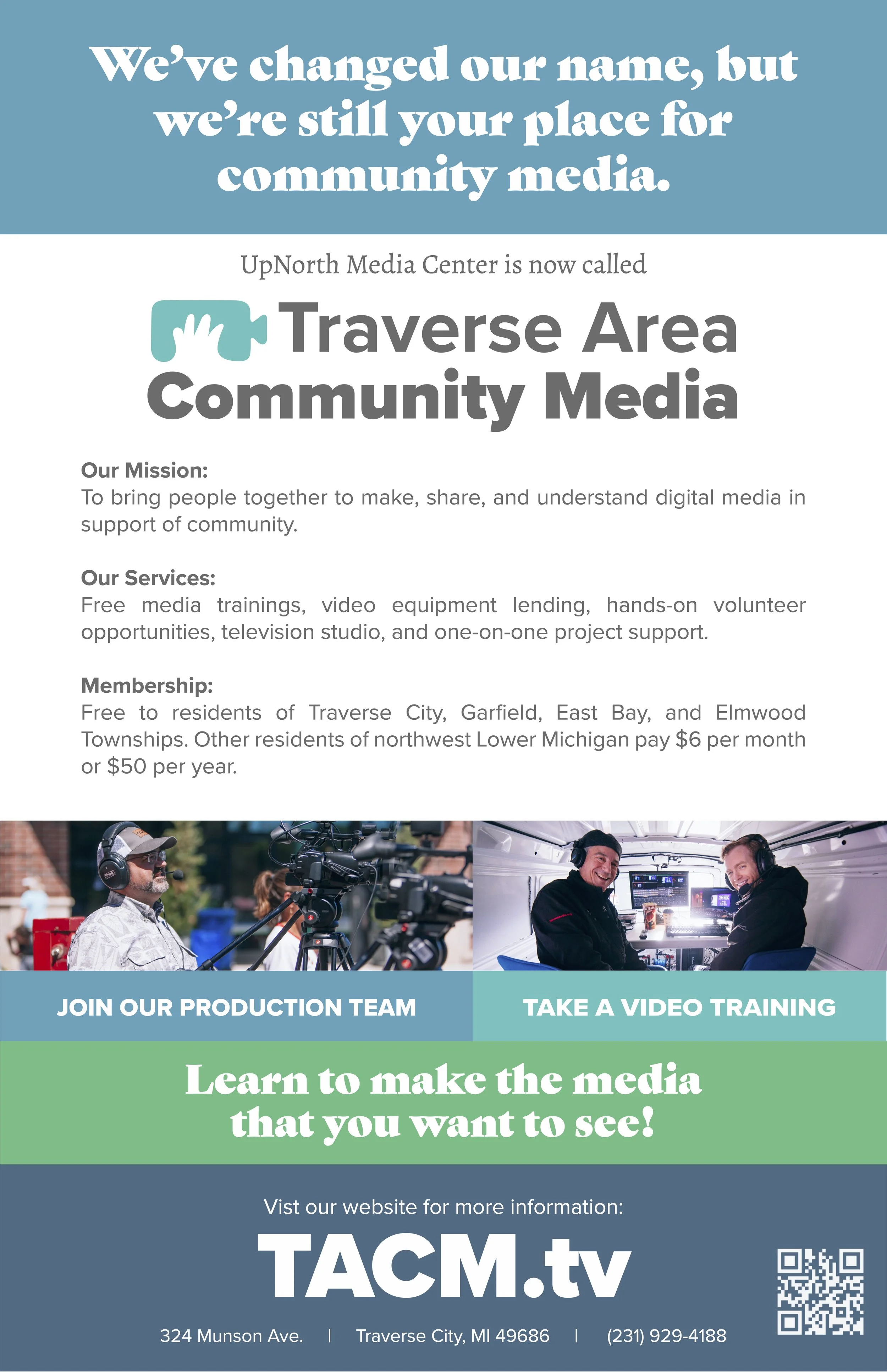
The decision to rebrand UpNorth Media Center to Traverse Area Community Media came from a desire to clarify our identity and eliminate the brand confusion caused by the many "UpNorth" brands in the region, particularly UpNorth Live. We wanted a name that more clearly described who we are and what we do (“Community Media”) while also highlighting the region we serve (“Traverse Area”). While the full name is descriptive, we often use the shorter TACM or TACM.tv for simplicity and consistency across platforms.
TACM Logo Design
For the logo, I wanted to create something playful, minimalistic, and modern to reflect our fresh start. The old design had grown outdated, so I drew inspiration from the simple camcorder icon often used in film storyboards. Using negative space, I integrated a hand holding the camcorder, symbolizing active creation and documentation—core elements of community media. This imagery captures the spirit of collaboration, storytelling, and accessibility that defines our mission.


Primary Color Palette
To reinforce our connection to the Grand Traverse region, I chose a medium-toned teal as the primary logo color. This specific teal was sampled directly from the waters of West Grand Traverse Bay on a sunny day, grounding our visual identity in the natural beauty of our community. The broader branding uses greens and blues, reflecting the region’s deep connection to water and lush forests, two essential elements of life in northern Michigan.

The result is a cohesive, meaningful brand that celebrates our role in empowering local voices while honoring the natural richness of the Traverse Area. The rebrand has helped us communicate our purpose more effectively, strengthening our connection to the community we serve.
Logo Variations and Applications
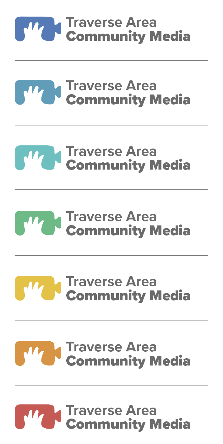
Color Variations
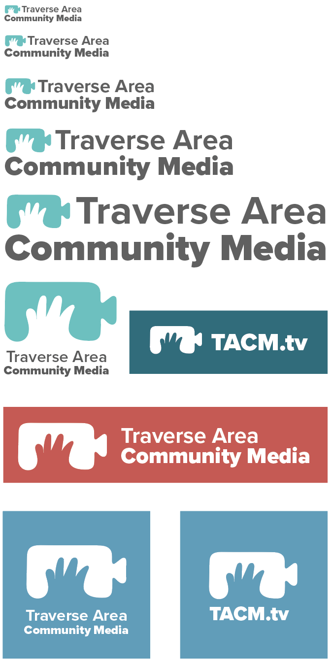
Layout and Size
Branding
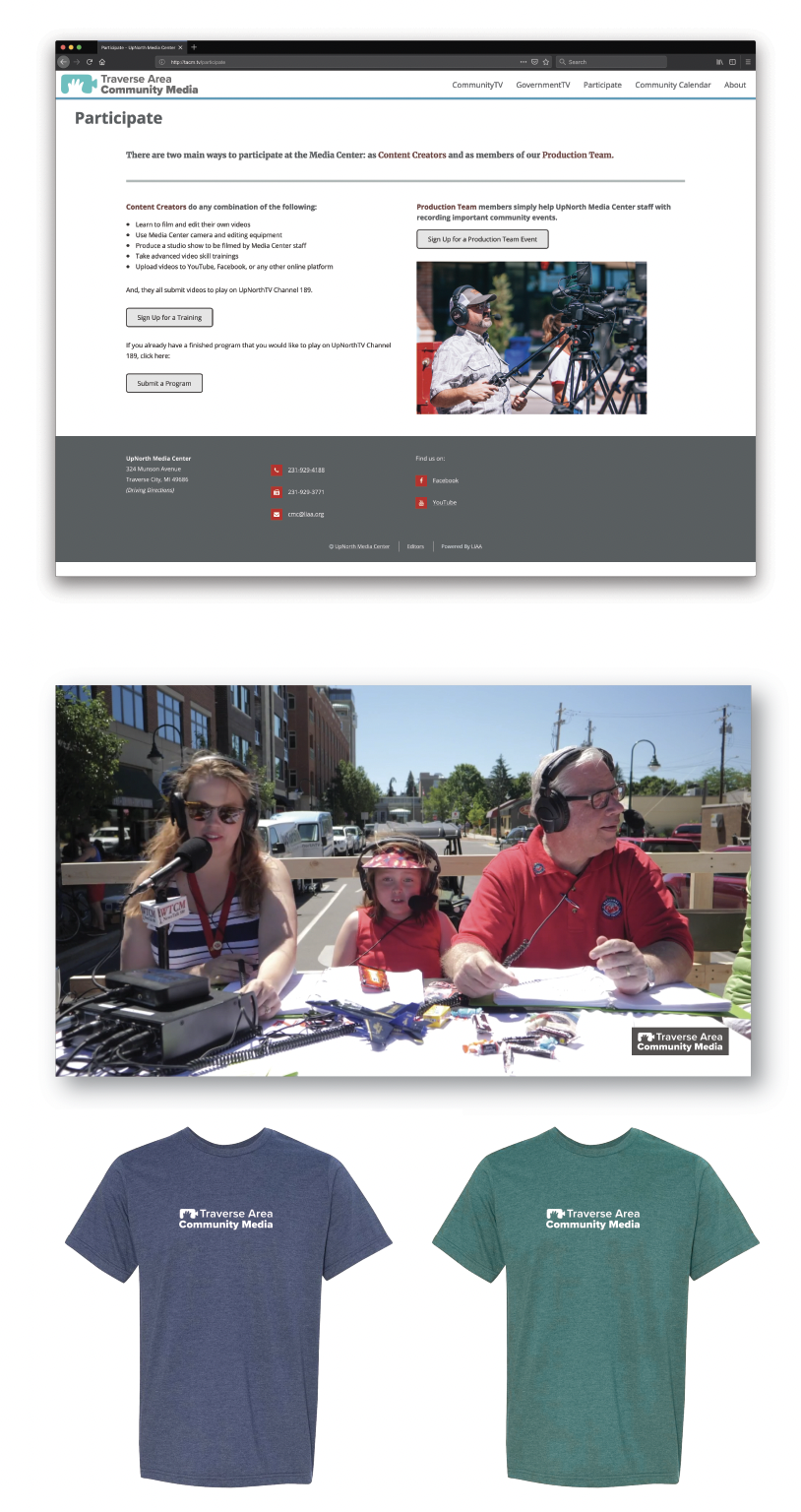
More Branding Materials
Rack Card (front)

Rack Card (back)

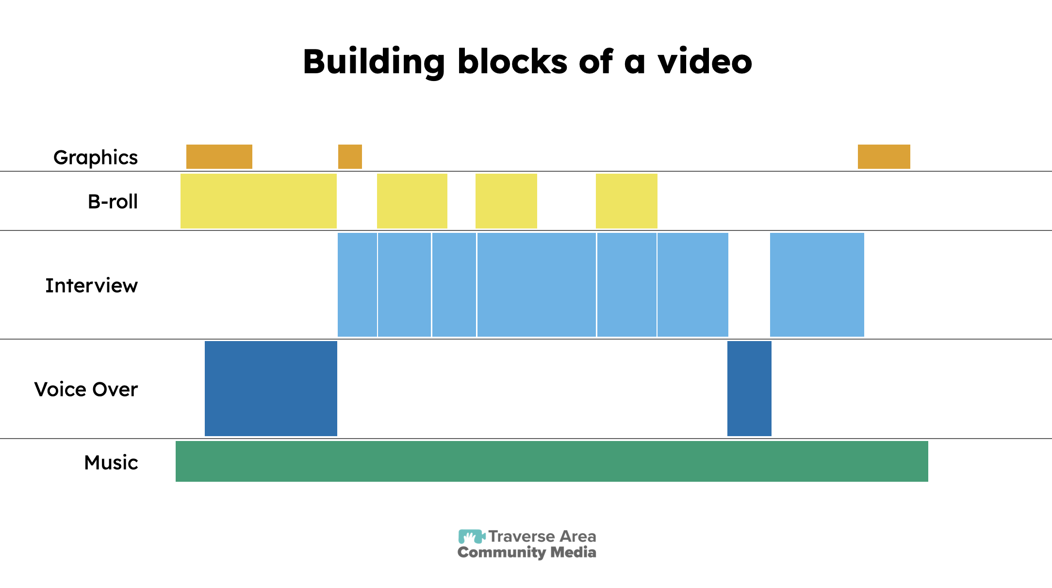
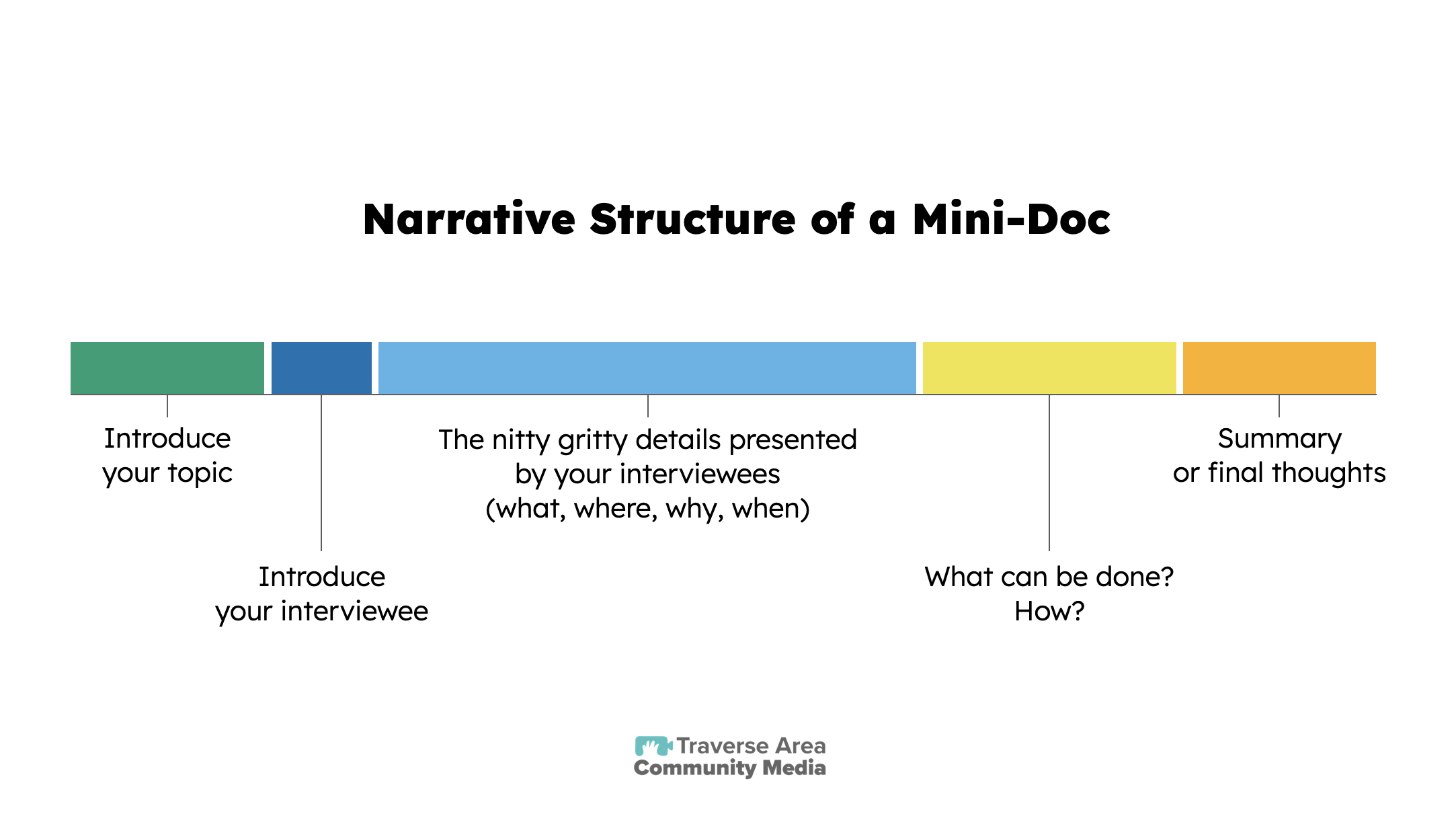
Trainings Slides
Much of what I have designed for use at TACM is educational in nature. For this reason, I have always strived to use simple designs centered around accessibility. These two slides from a training about making mini-documentaries exemplify simplicity and accessibility. The shapes are designed to resemble a video editing timeline, but are color coded using the Okabe-Ito color palette, which is specifically designed for color-blind accessibility.

Animated Maps & GIS Integration
Video Alt Text: An animated zoom into a map of Mesoamerica, starting from a wide view of North and Central America. A red line traces a southward route as the camera moves in, revealing key locations with large white labels: Acteal, Chiapas, México; Sololá, Guatemala; Chinameca, El Salvador; and Estelí, Nicaragua. The labels have a 3D effect with dark shadows for emphasis. The final frame shows the full route, with a shallow depth-of-field effect subtly blurring surrounding areas to highlight key locations.
Video alt text: A 3D-animated zoom into a map of Mesoamerica, following the red route from Acteal, Chiapas, México to Sololá, Guatemala. The camera shifts focus as the route is drawn, with large white labels appearing dynamically. A shallow depth-of-field effect keeps the active location sharp while softly blurring the surrounding areas.
Animated Map of Mesoamerica
These two animations were created using a GIS-based workflow combined with motion graphics techniques. Each drive route was first designed in ArcGIS and then imported into Adobe After Effects, where it was aligned with a matching map layer. The routes were animated along their GIS paths, dynamically revealing the journeys over time. A 3D camera and virtual light source were used to simulate a large-aperture camera effect, creating a shallow depth of field that keeps key locations and labels in sharp focus while subtly blurring the surrounding map. The result is a cohesive, cinematic visualization of travel routes across Mesoamerica, bringing geographic data to life through motion and perspective.
Video alt text: A 3D-animated flyover of a GIS-based map, beginning in South Boardman and moving northward to the Greater Traverse City area. The animation highlights rivers, streams, and roads, with blinking red dots representing culvert road-stream crossings. As the camera moves, additional details appear, including more streams and crossings. The depth-of-field effect keeps key areas sharp while subtly blurring the surrounding terrain, creating a sense of movement and focus.
Animated Map of Culverts
This animation was also created using ArcGIS layers in After Effects to visualize the density of culvert crossings and their impact on stream connectivity. It was featured in the medium-length documentary Restoring Aquatic Ecosystems by Nature Change, which explores the effects of human infrastructure on Michigan’s waterways. The film discusses how roads, culverts, and land development have altered natural stream flows, impacting aquatic habitats and Anishinaabe cultural practices. It highlights the efforts of conservationists, Indigenous leaders, and policymakers working to restore free-flowing rivers and improve ecosystem health.